Screenshot of an online learning module about zebra mussel population growth, showing a multiple-choice question and a video call with several participants.

Working towards an Open, Accessible Web

In 2021, I was working at the University of Ottawa as part of a multidisciplinary team helping professors convert their course materials into online learning experiences. In response to Adobe’s end-of-life for Flash, I helped redesign an ecology lesson into a modern, accessible, web-based experience.

In 2021, I was working at the University of Ottawa as part of a multidisciplinary team helping professors convert their course materials into online learning experiences. In response to Adobe’s end-of-life for Flash, I helped redesign an ecology lesson into a modern, accessible, web-based experience.

In 2021, I was working at the University of Ottawa as part of a multidisciplinary team helping professors convert their course materials into online learning experiences. In response to Adobe’s end-of-life for Flash, I helped redesign an ecology lesson into a modern, accessible, web-based experience.

In 2021, I was working at the University of Ottawa as part of a multidisciplinary team helping professors convert their course materials into online learning experiences. In response to Adobe’s end-of-life for Flash, I helped redesign an ecology lesson into a modern, accessible, web-based experience.

A Golden Opportunity

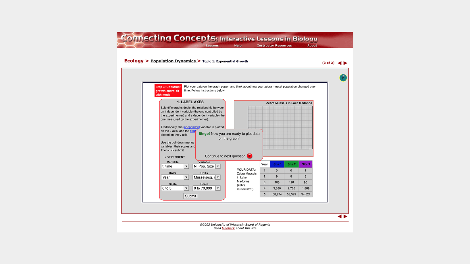
The original Flash-based lesson suffered from several accessibility and usability issues. Because it used custom, non-native controls, it wasn’t compatible with screen readers and didn’t support keyboard-only navigation. Its fixed layout wasn’t responsive, making it difficult to use on tablets and smaller devices. Furthermore, the interface and illustrations were visually outdated, which distracted from the educational content and didn’t meet modern expectations.

My task was to work with the professor who sponsored the project and acted as the subject matter expert, a multimedia specialist, and a web developer to create a new user experience that would address these issues.

Screenshot of the original lesson titled 'Connecting Concepts: Interactive Lessons in Biology,' with breadcrumb 'Ecology > Population Dynamics > Topic 1: Exponential Growth (3 of 3).' The main panel shows Step 3 'Construct growth curve: fit with model' and a 'Label Axes' form with dropdowns for independent variable (t, time), dependent variable (N, population size), units (Year; mussels/sq. m.), and scales (0 – 5; 0 – 70,000), plus a Submit button. To the right is a blank graph grid titled 'Zebra Mussels in Lake Madonna,' and below it a table listing zebra mussel counts at Site 1, Site 2, and Site 3 over years 1–5.

A screenshot of the original design.

Approach

With no access to student users for direct testing, I used Jakob Nielsen’s 10 Usability Heuristics for User Interface Design to guide my evaluation of the existing lesson. My analysis surfaced key areas for improvement:

  • Unpredictable interface and confusing navigation

  • Non-responsive, fixed layout

  • Lack of alternative text and captions for images and graphs

  • Outdated and inconsistent visuals

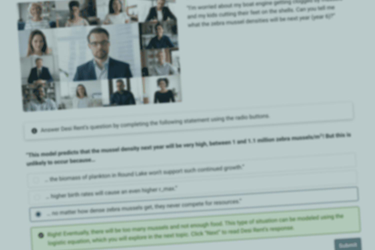
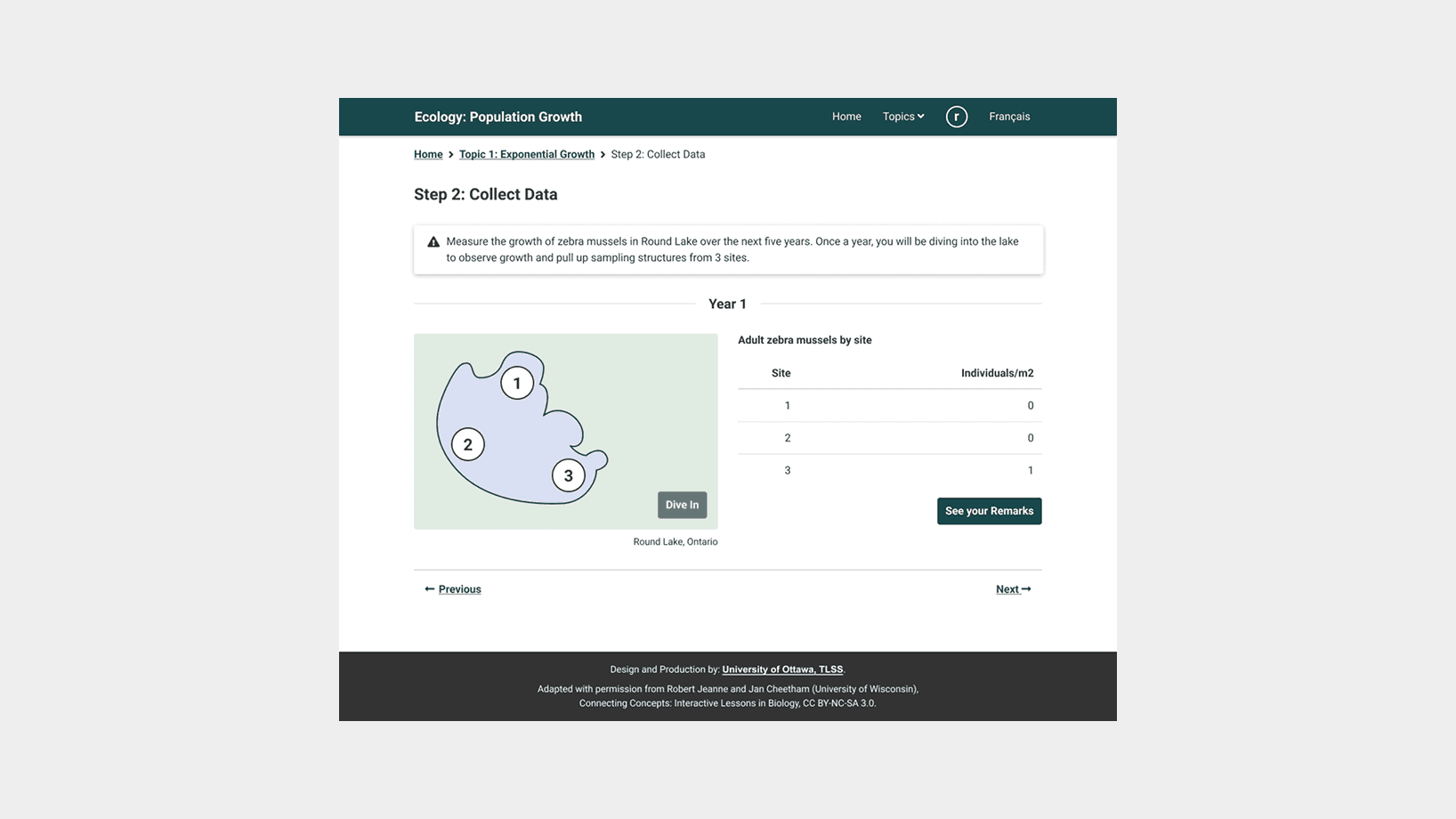
To tackle the redesign, I broke the lesson down by topic (three in total), creating high-fidelity mockups for each. These were submitted for feedback to the team before the implementation started. I also helped standardize feedback patterns and form controls across quizzes to ensure consistency and ease of use.

Screenshot of a redesigned interactive biology lesson page titled ‘Ecology: Population Growth’. At the top is a dark-teal header with the site title, ‘Home’ link, ‘Topics’ menu, a profile icon, and ‘Français’. Below, breadcrumb navigation reads ‘Home > Topic 1: Exponential Growth > Step 4: Answer Questions at a Conference’, followed by the heading ‘Step 4: Answer Questions at a Conference’. The main panel shows a 4×3 grid of video-conference participant thumbnails alongside a ‘Desi Rent asks:’ box containing the question ‘I’m worried about my boat engine getting clogged by mussels … Can you tell me what the zebra mussel densities will be next year (year 6)?’. Below is a radio-button prompt: ‘This model predicts that the mussel density next year will be very high … But this is unlikely to occur because …’ with three answer choices. The third option (‘…no matter how dense zebra mussels get, they never compete for resources.’) is selected and highlighted by a green feedback box explaining that logistic modeling will be covered next. A ‘Submit’ button sits to the right, and ‘← Previous’ and ‘Next →’ links appear just above a dark footer crediting the University of Ottawa and the original UW lesson under CC BY-NC-SA 3.0.

A screenshot of the new design. A significant portion of the content included quizzes for which proper feedback was given upon submitting an answer.

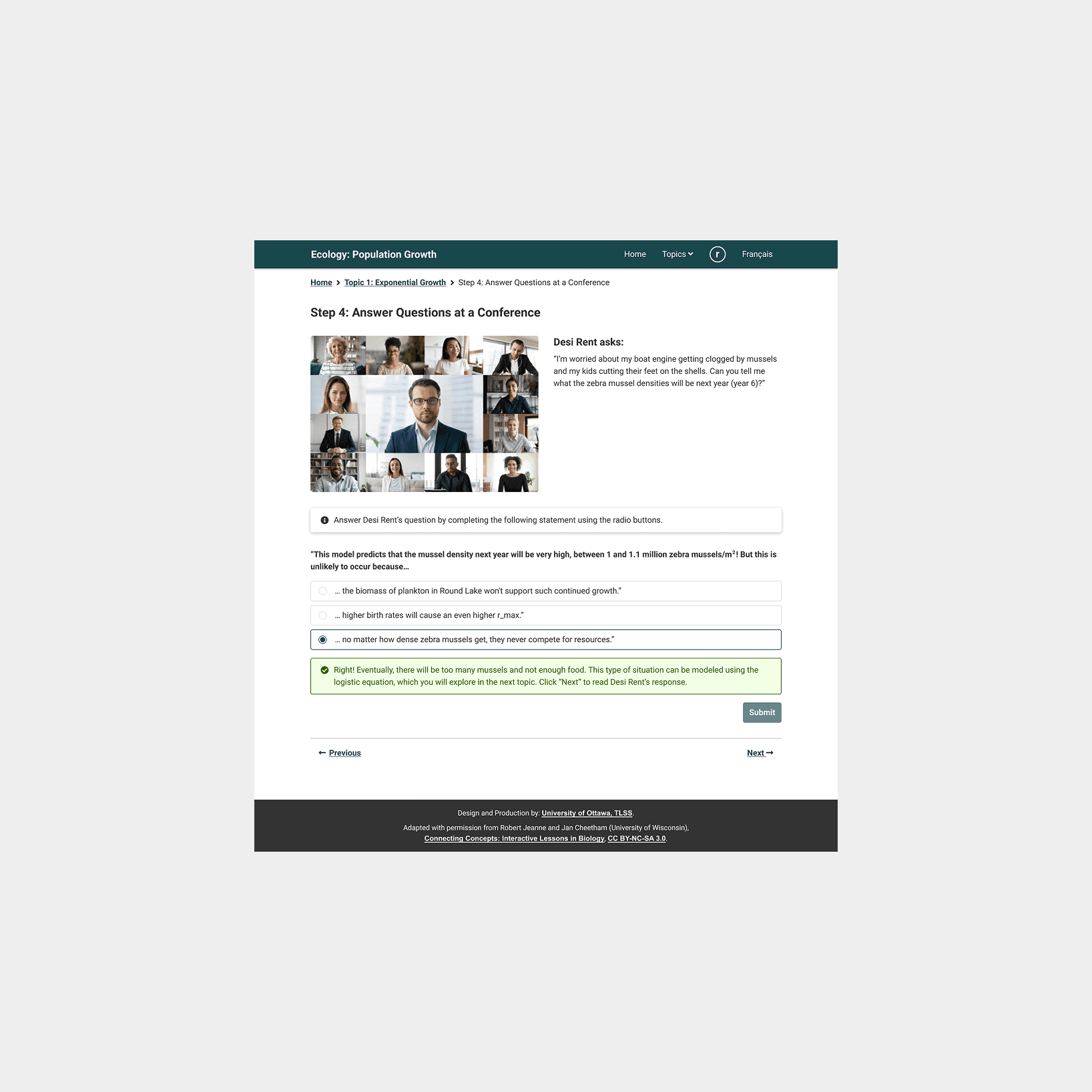
Toward the end of the project, I worked with the subject matter expert to write and translate alternative text and captions for graphs and images. I also supported integration by formatting the translated content into JSON.

Screenshot of the redesigned interactive biology lesson page with breadcrumb ‘Home > Topic 3: Elephant Population Growth in Kruger National Park > Section 1. Introduction (Part 4)’ and heading ‘Section 1. Introduction (Part 4)’. Below, a ‘Logistic Growth’ blurb explains use of the logistic model for African bush elephants (1903–1996) and a carrying capacity of 7,500. A callout titled ‘The Big Picture’ invites users to explore four time periods. The central line graph (y-axis ‘Number of Elephants (× 1000)’, x-axis 1903–1996) shows a pale-green shaded region (1903–1920), a dark S-shaped logistic curve leveling near 8, and a lighter historical line, with a caption attributing data to the KNP Elephant Management Plan. To the right, a card ‘Early Years: 1903–1920’ describes initial hunting impacts above a photo of an elephant in grass, with arrow controls. ‘Previous’ and ‘Next’ links appear below, and the dark footer credits the University of Ottawa, TLSs, and the original UW lesson under CC BY-NC-SA 3.0.

A screenshot of the new design. The content also included many graphs for which thorough descriptions where provided as alternative text, both in English and French.

Outcome

The redesigned lesson was successfully delivered and well-received by the professor. The new version addressed major usability issues and brought the experience up to current web standards, ensuring compatibility across devices and assistive technologies. The consistent navigation, responsive layout, and modern graphics created a more inclusive and engaging experience for undergraduate students.

Screenshot of the original lesson with breadcrumb ‘Ecology > Population Dynamics > Topic 1: Exponential Growth’ and a ‘(3 of 3)’ indicator. The main panel is labeled ‘Step 2: Collect Data’ and is divided into three columns. Left: a satellite-style image of Lake Madonna marked ‘Year 1’ in red, with three red numerals (1, 2, 3) indicating sample sites, and below it an illustration of a scuba diver. Center: three schematic sampling trays labeled Site 1, Site 2, Site 3 above a clipboard reading ‘Adult Mussels: Individuals/m²’ with counts (Site 1: 0; Site 2: 0; Site 3: 1), followed by diver’s notes (‘That was easy!… look at this one I found at Site 3!’) and a photo of a hand holding a mussel. Right: a gray box titled ‘Annual Average of Samples’ containing a table (# ZM/m²) showing Year 1: 0.33 and blank rows for Years 2–5, plus a red ‘Go to next year’ button. Below the panel are left/right navigation arrows and a footer crediting the University of Wisconsin Board of Regents.

A screenshot of the original design.

Screenshot of the redesigned lesson with breadcrumb ‘Home > Topic 1: Exponential Growth > Step 2: Collect Data’ and heading ‘Step 2: Collect Data’. A warning box instructs users to measure zebra mussel growth in Round Lake, Ontario over the next five years. Below, a pale-green stylized map of Round Lake marked ‘Year 1’ shows three white circles numbered 1, 2, 3 and a ‘Dive In’ button. To the right, a table titled ‘Adult zebra mussels by site’ lists Site 1: 0, Site 2: 0, Site 3: 1 with a ‘See your Remarks’ button. ‘Previous’ and ‘Next’ links appear beneath, and a dark footer credits the University of Ottawa, TLSs, and the original UW lesson under CC BY-NC-SA 3.0.

A screenshot of the same section after the redesign.

Takeaway

This project gave me a deeper appreciation for the complexity of designing effective questionnaires. I had to carefully consider how to structure questions, present answers, and provide validation and feedback in a way that felt intuitive and supportive to learners. It also reinforced the importance of accessibility and semantic structure in web-based learning environments.