Texidium — Balancing Consistency and Familiarity for an e-Reader
In 2018, I was working for Kivuto Solutions, an Ottawa-based company specializing in digital asset management and distribution for colleges and universities across the world.
When the web version of their e-reader application, Texidium, received a visual update, all other platforms needed to be updated as well. I was tasked with auditing the interface on Android, iOS, macOS, and Windows, and guide the implementation by providing design specifications.
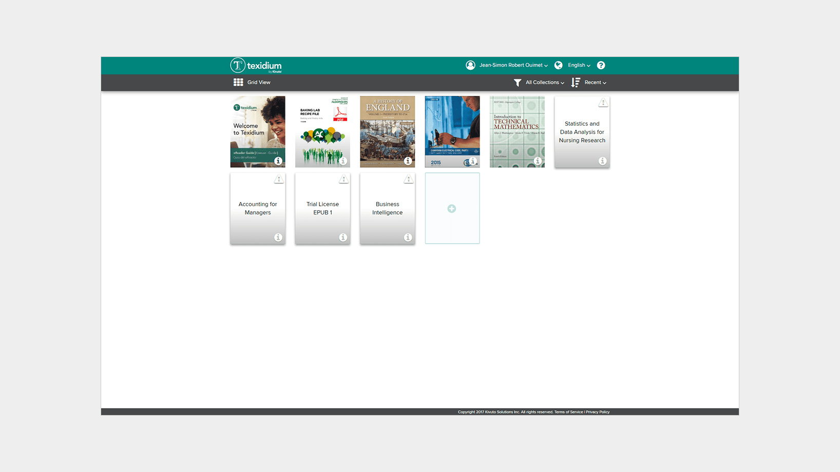
Screenshot of the web application which served as the visual baseline for the update on the other platforms.
Screenshot of the web application which served as the visual baseline for the update on the other platforms.
Screenshot of the web application which served as the visual baseline for the update on the other platforms.
Screenshot of the web application which served as the visual baseline for the update on the other platforms.
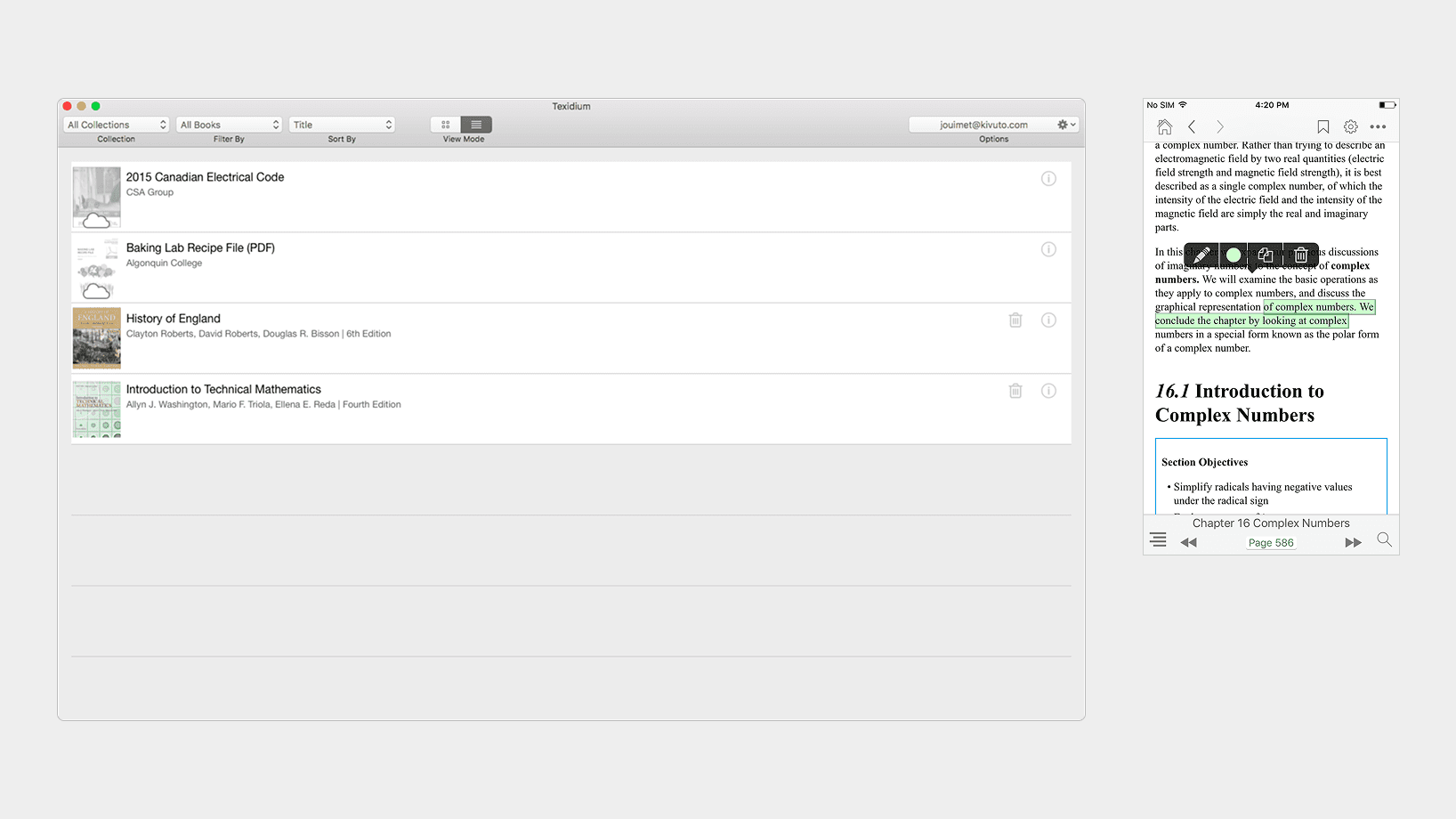
Screenshots of the original design on macOS (left) and iOS (right).
Screenshots of the original design on macOS (left) and iOS (right).
Screenshots of the original design on macOS (left) and iOS (right).
Screenshots of the original design on macOS (left) and iOS (right).
On the Move
Most students use multiple devices throughout the day, such as a laptop at school and a phone when commuting. Having a similar experience across devices not only strengthens the overall brand presence of the product, it helps them achieve their goal, which is to study.
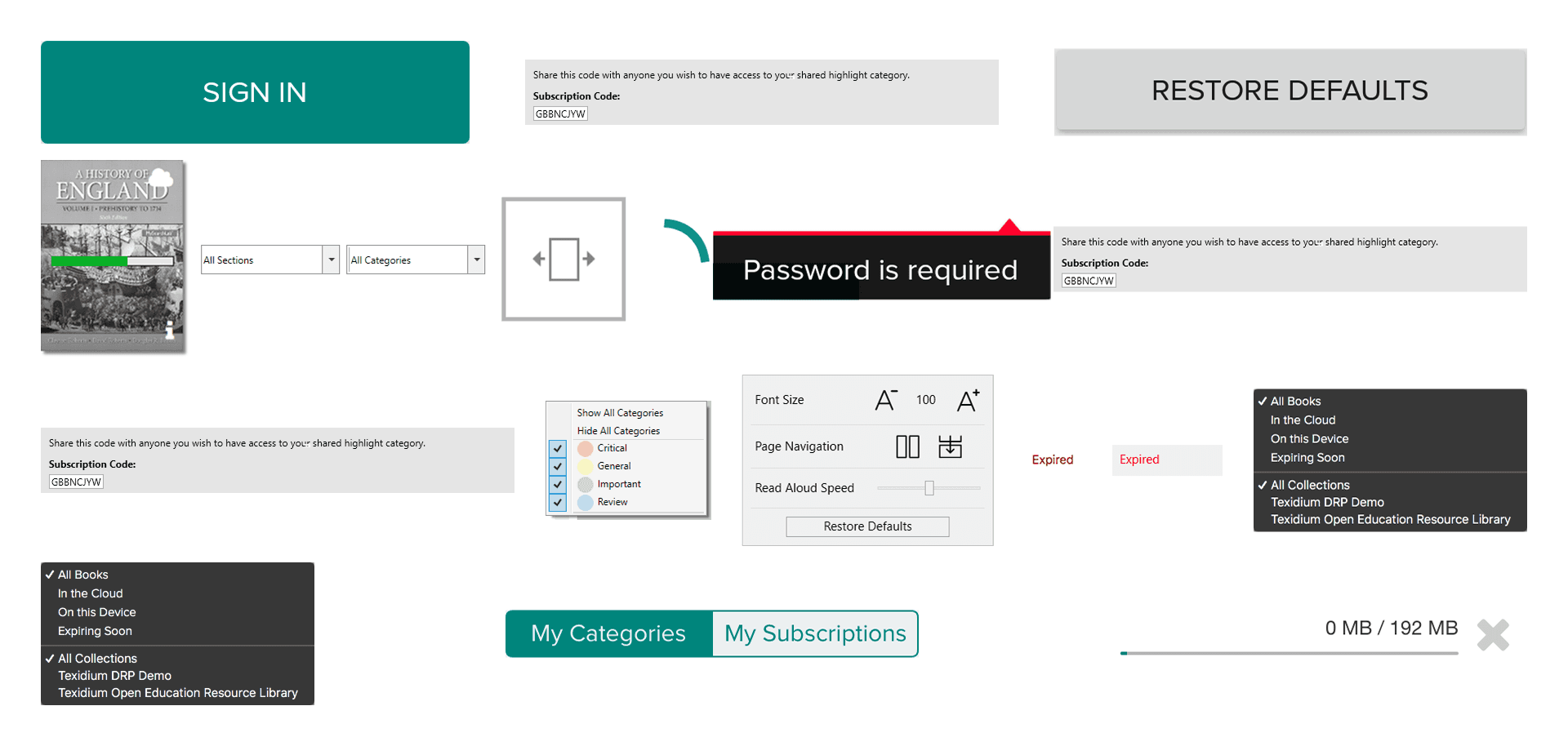
Visual elements guiding the new version of the application across platforms.
Visual elements guiding the new version of the application across platforms.
Visual elements guiding the new version of the application across platforms.
Visual elements guiding the new version of the application across platforms.
Approach
Using Brad Frost’s Atomic Design Methodology, I captured and categorized screenshots of all contexts and interaction states of the application on each platform. I then named and organized the screenshots so I could more easily highlight visual and behavioral differences.
Brad Frost’s atomic design methodology helped me break down the application’s interface into smaller components.
Brad Frost’s atomic design methodology helped me break down the application’s interface into smaller components.
Brad Frost’s atomic design methodology helped me break down the application’s interface into smaller components.
Brad Frost’s atomic design methodology helped me break down the application’s interface into smaller components.
Screenshots of interface elements across platforms.
Screenshots of interface elements across platforms.
Screenshots of interface elements across platforms.
Screenshots of interface elements across platforms.
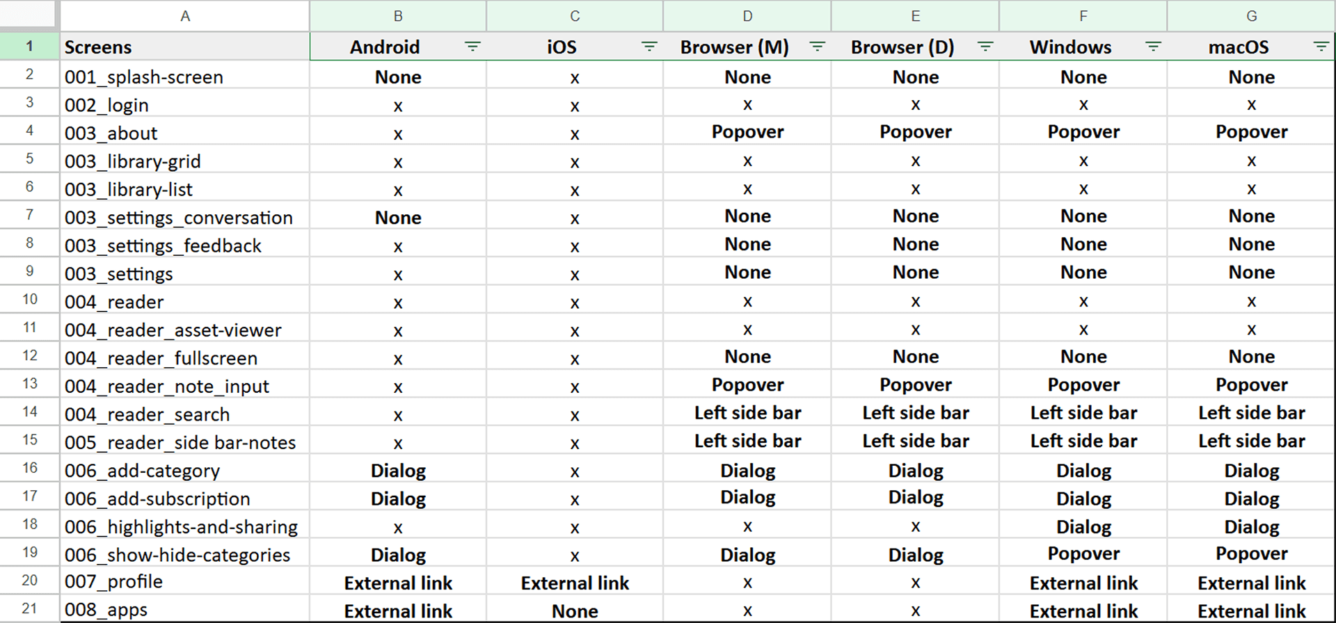
Spreadsheet listing interface elements, their implementations or absence across platforms.
Spreadsheet listing interface elements, their implementations or absence across platforms.
Spreadsheet listing interface elements, their implementations or absence across platforms.
Spreadsheet listing interface elements, their implementations or absence across platforms.
Outcome
Once I had a clear vision for how the experience would look and feel on a specific platform, I created a prototype to facilitate discussions with the software engineer responsible for the implementation. I often had to adapt patterns rather than replicate them; for example, on iOS, I decided to use alerts or action sheets when needing to present information or suggests actions in a overlaying context instead of relying on custom-made dialogs.
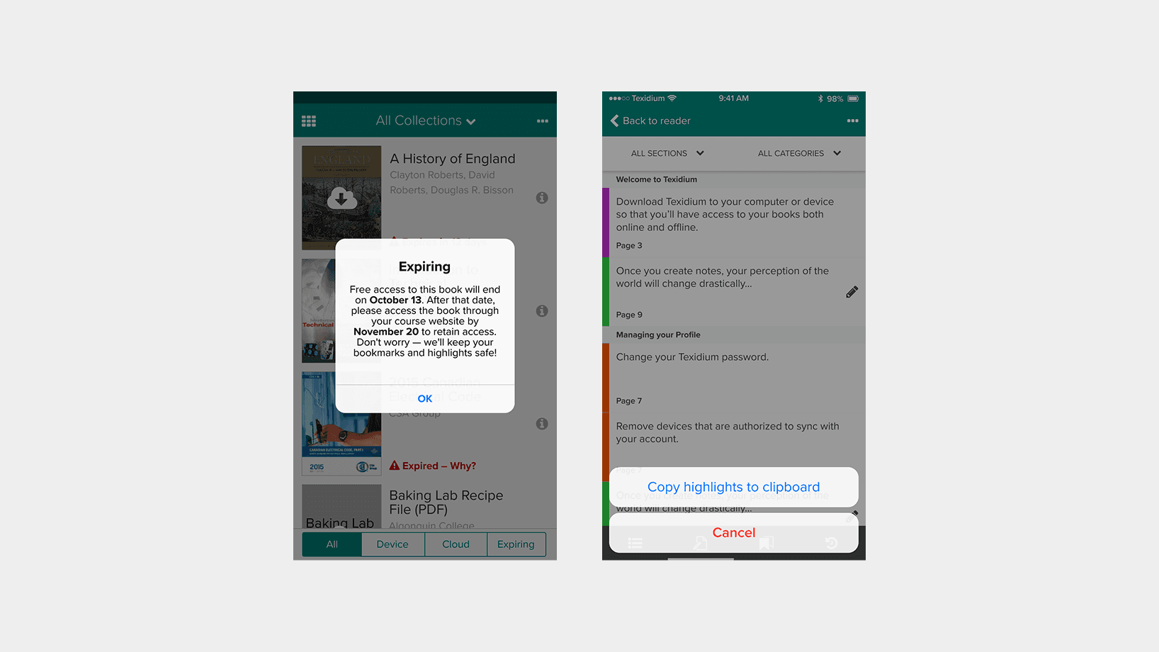
Screenshots of the updated design on iOS, showing the use of native controls: an alert (left), and an action sheet (right).
Screenshots of the updated design on iOS, showing the use of native controls: an alert (left), and an action sheet (right).
Screenshots of the updated design on iOS, showing the use of native controls: an alert (left), and an action sheet (right).
Screenshots of the updated design on iOS, showing the use of native controls: an alert (left), and an action sheet (right).
Screenshots of the updated design on macOS and iOS.
Screenshots of the updated design on macOS and iOS.
Screenshots of the updated design on macOS and iOS.
Screenshots of the updated design on macOS and iOS.
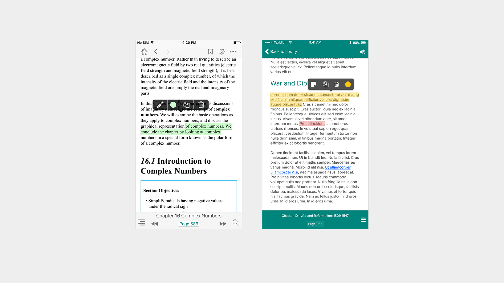
Screenshots of the iOS application: old design (left) and updated design (right).
Screenshots of the iOS application: old design (left) and updated design (right).
Screenshots of the iOS application: old design (left) and updated design (right).
Screenshots of the iOS application: old design (left) and updated design (right).
Takeaway
The project helped solidify Texidium’s brand identity across platforms while creating a strong foundation for a more cohesive development process internally. Designing for multiple platforms in parallel encouraged me to create solutions that are flexible enough to suit a variety of contexts, a skill I still use to this day.